
Establishing the First Digital Credential Testing System
PROJECT TYPE
UX Design, UI Design, Product Strategy
ROLE
UX Designer
DELIVERABLES
Wireframes, Hi-fi Prototypes, Design System
TIMELINE
4 Months
Problem
Designing a Product With No Playbook
Across Canada, government agencies and organizations faced a critical challenge: no existing platform could test whether digital IDs would work reliably, securely, and universally.
We needed to build a first-of-its-kind cloud platform that would allow interoperability testing. This meant designing not just a product, but an entire system architecture to support complex workflows and diverse users, with no prior example to follow.
Solution
DTT: The Key To Digital Credential Interoperability
I led the end-to-end UX and design system development for the Digital Trust Test Bench (DTT), a cloud-based quality assurance platform that:
-
Streamlined multi-step, technical testing processes
-
Surfaced complex information for both technical and non-technical audiences
-
Built trust and alignment across Canada’s digital credential ecosystem
The result was design infrastructure that could evolve alongside emerging standards and user needs.
Strategy & Approach
How do you design a system without any precedent?
I tackled this ambiguity by identifying key functional and technical needs, developing a logical structure for testing workflows and data visualization, creating prototypes to explore and validate the user journey and system interactions, and finally testing and implementing user feedback.
.png)
1. Information Architecture
DTT was groundbreaking in nature. This meant the team had to identify for the first time what information users would need as they progressed through a digital credentials testing flow. The information architecture became the blueprint for this novel experience.
Impact: Essential information was defined and categorized for each step of the testing flow, ensuring the structure could scale and adapt to accommodate new features without disrupting the user experience.

2. Concept Development
The greatest challenge was determining the most effective way to present complex test results to users. At the onset of the concept development phase, I explored a variety of interfaces designed to present complex test data, identifying successful approaches to visualization and usability.
Exploratory Research
.png)
Lo-Fi Mockups
I developed multiple low-fidelity mockups, enabling the team to explore and compare various approaches to visualizing intricate data.

3. Prototype System Interactions
Impact: Early stakeholder input on these mockups revealed a significant gap in familiarity with digital credential concepts.
As a result, we realized we needed multiple formats to address the diverse needs and mental models of our user base.
-
Non-technical users needed high-level overviews to quickly understand testing results without being overwhelmed by technical jargon.
-
Technical users required detailed, structured data to troubleshoot, validate outputs, and ensure conformance at a granular level.
By separating the data into these two layers, we could ensure the interface was accessible to newcomers, while still being robust and functional for advanced users.
Prototypes focused heavily on navigation because credential testing is multi-step, technical, and unfamiliar to most users.
By prototyping different navigation models (horizontal tracker, shown to the right, breadcrumbs, vertical sidebar), we were able to evaluate:
-
Clarity: Could users understand what step they were on?
-
Efficiency: Did the navigation support movement between stages?
-
Accessibility: Was the structure intuitive for both technical and non-technical users?

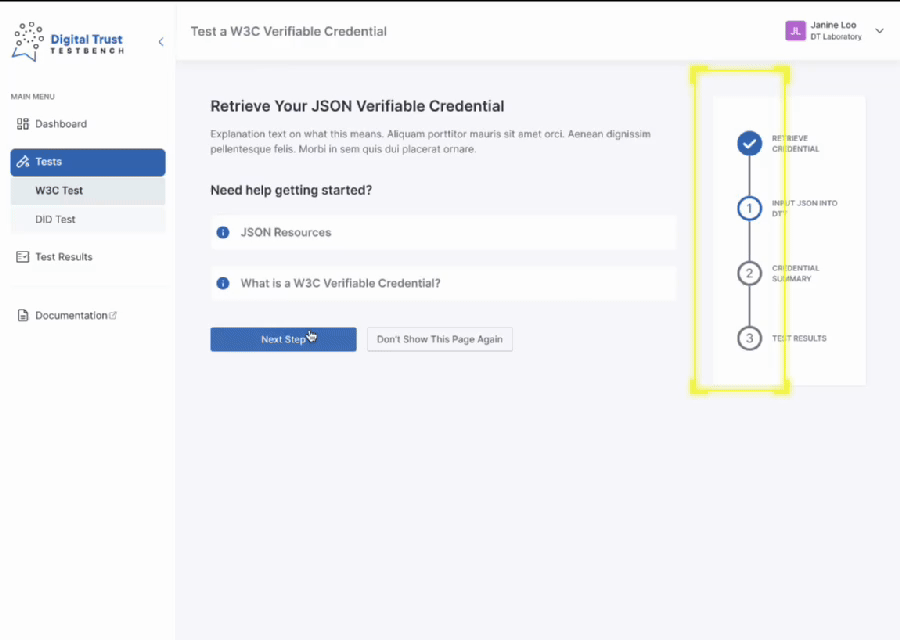
These iterations lead to a vertical, numbered navigation with a final-step flag to clearly indicate the process endpoint. This was chosen because:
-
Vertical took up less screen space, keeping the testing UI front and center
-
Familiar stepper pattern to help users feel grounded during a new and complex process
I ensured this navigation had interactive visual cues:
-
Steps remain locked until requirements are met, preventing premature navigation
-
Users can navigate backward at any time for flexibility and control
4. Design Critique Workshop
Challenge: As prototyping began, stakeholder enthusiasm led to an expanding list of feature requests, which began to slow momentum and blur focus. With no initial consensus on what the MVP should include, we were in desparate need of alignment and clarity.
Solution: I facilitated a design critique workshop in Miro to gather various internal stakeholder perspectives and refine the user experience. Through a dot voting activity and collaborative discussions, we identified areas for improvement, clarified user priorities, and aligned on the most intuitive solutions.

Key Workshop Takeaways
Overall, stakeholders wanted to see a simpler journey that would require less mental load on the user. Key opportunities included:
-
Prevent mistakes by enabling Auto-Save instead of requiring it as an action by the user.
-
Shorten the journey by renaming Step 1 to Step 0 and allow users to skip it via a settings toggle.
-
Relocate help tips to reduce visual distraction and ensure the main focus remains on the task.
-
Provide clear reminders of the testing goals to set expectations during the process.
5. Analysis & Prioritization
Following the first workshop, I analyzed stakeholder feedback for actionability:
-
Simple UI Changes
-
Could be addressed quickly, such as adjusting text size or colors
-
-
Mockup Testing Needed
-
Required further exploration and validation through mockups
-
-
Out of Scope
-
Exceeded the current project's scope and required prioritization
-
.png)
Prioritization Workshop
I facilitated a prioritization workshop to address the suggestions requiring further evaluation. The process was structured as follows:
-
Impact-Effort Matrix
-
Evaluate each suggestion based on its potential impact and the effort required to implement it.
-
-
MVP Focus
-
Identify which items should be prioritized for inclusion in the Minimum Viable Product (MVP).
-
This approach ensured a balanced and strategic selection of features, aligning with project goals and resource constraints.

6. Iterating & Refining
Following the prioritization workshop, I addressed each action item that emerged from the analysis process.
I developed a high-fidelity, clickable prototype in Figma to visualize the final changes.
The final designs enabled a one-stop shop solution, supporting everyone from developers and product owners to government decision-makers.


Scannable credential summaries, advanced tables, and separating technical information across tabs allowed for flexible testing.
.png)
Final Design
7. Implementing a Scalable Design System
The Digital Test Bench had no established documentation process. I set up and documented new styles, guides, and components to craft a design system that was:
-
Sustainable for future teams: A robust foundation for designers to build upon.
-
A single source of truth for developers: Comprehensive documentation ensured clarity and alignment.
-
Adaptable to evolving needs: Allowing for easy updates as user requirements and business objectives change.
I documented the MVP screens in Figma, covering variable component states, breakpoints for all screen sizes, and unique edge cases and behaviors.


Outcome & Reflections
Key Outcomes
The Digital Trust Test Bench launched as a first-of-its-kind platform supporting interoperability across Canada’s digital credentials ecosystem. By grounding our approach in system thinking from the outset—defining visual standards, prioritizing accessibility, and building scalable components—we delivered not just a product, but a foundation for future innovation.
Impact:
-
A scalable design system ready to grow with the product.
-
Defined navigation structure and clear user flows.
-
A flexible interface that adapts to both technical and non-technical audiences.
What I Learned
When I joined this project, the development team had already been working together for some time. As the only UX designer, I initially positioned myself as a contributor rather than a leader. What I didn’t realize was that, in a deeply technical environment, UX is often the only discipline with a full view of the user, the product vision, and the experience gaps across teams.
What I'd Do Next Time:
-
Stepped into a leadership role sooner, bringing cross-functional stakeholders together earlier and facilitating collaborative workshops to align on the user journey.


